case study — design & build
2B Rental — short-term stay website
A self-initiated website for a short-term rental home in Quincy, MA — designed in Figma and hand-built in VS Code to give the property its own place on the web.
the challenge
- Property only lived on third-party listing sites
- No standalone brand or shareable home
- Photography and copy buried in template layouts
goals
- Give the home a focused, warm online presence
- Let photography do the heavy lifting
- Keep the path from browsing to booking short
my focus
- Concept, content, and visual direction
- Layout and component design in Figma
- End-to-end front-end build in HTML, CSS, JS
approach
From listing tile to a place of its own
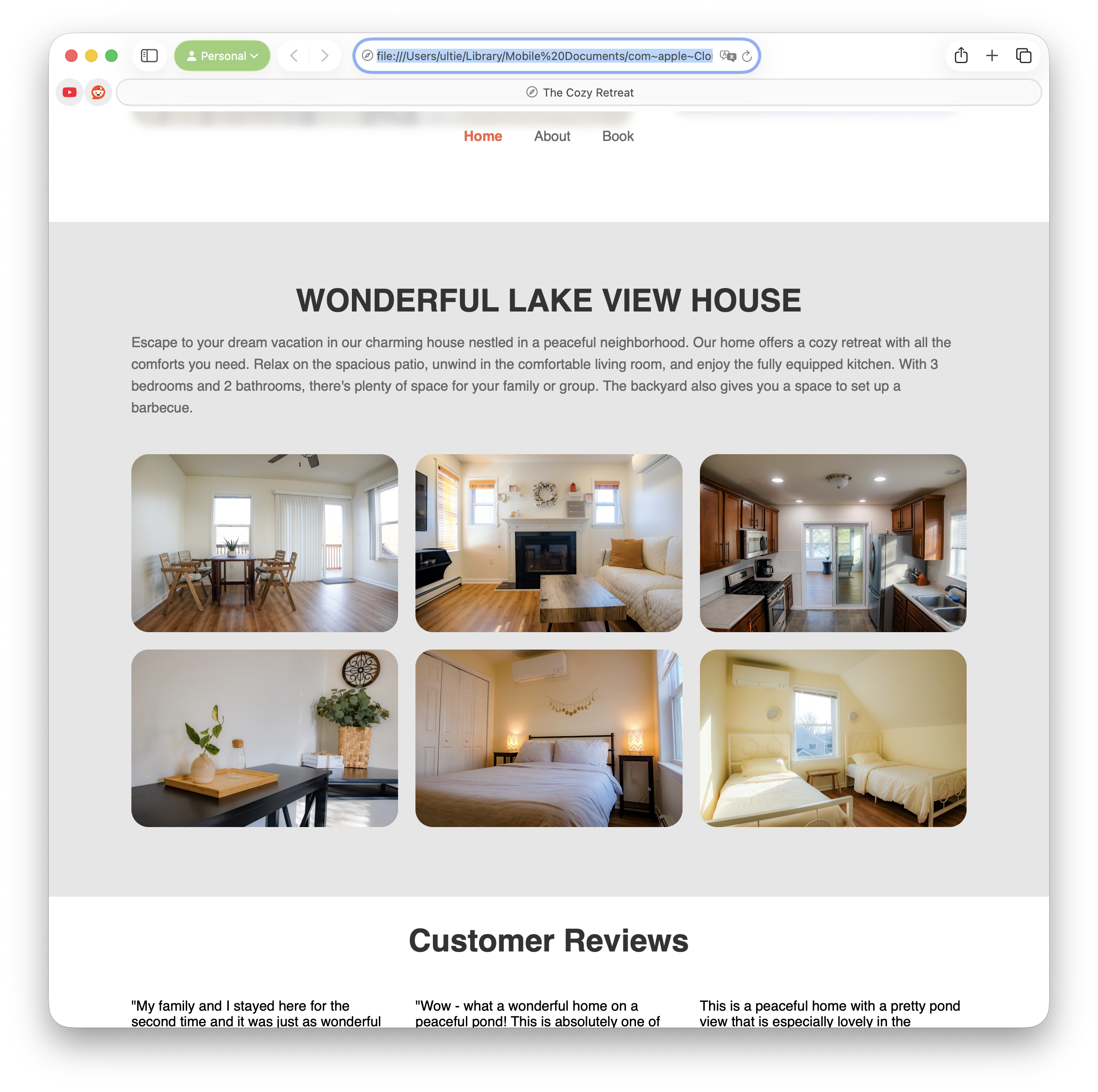
2B Rental is a three-bedroom short-term rental in Quincy, MA. It was renting well through third-party platforms, but it didn't have a place of its own on the web — no single link to share, no room to let the photography breathe, no voice for the home itself.
I scoped the project, designed the layout in Figma, then built the site from scratch in VS Code with plain HTML, CSS, and JavaScript. The work stretched across about six months of evenings and weekends — slow enough to iterate, fast enough to actually ship.
structure
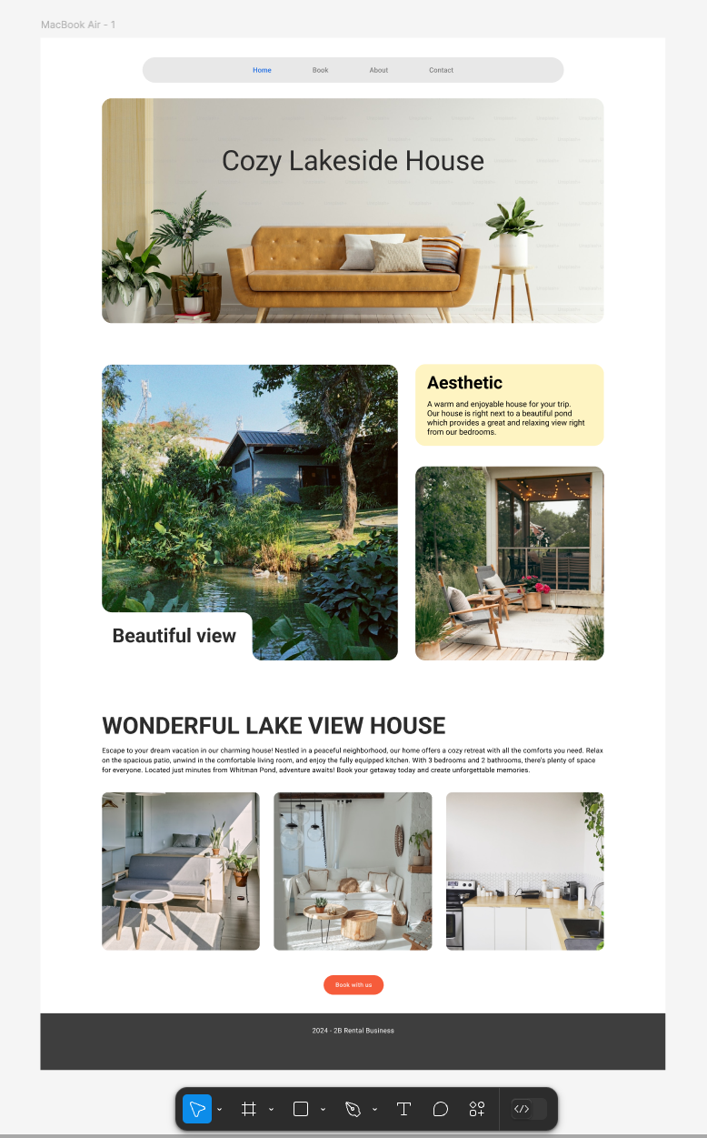
Wireframe
Sketched in Figma to settle the hierarchy before any styling: a hero with the home's name, a small gallery to set the mood, a written introduction, and a single primary action — book.
the build
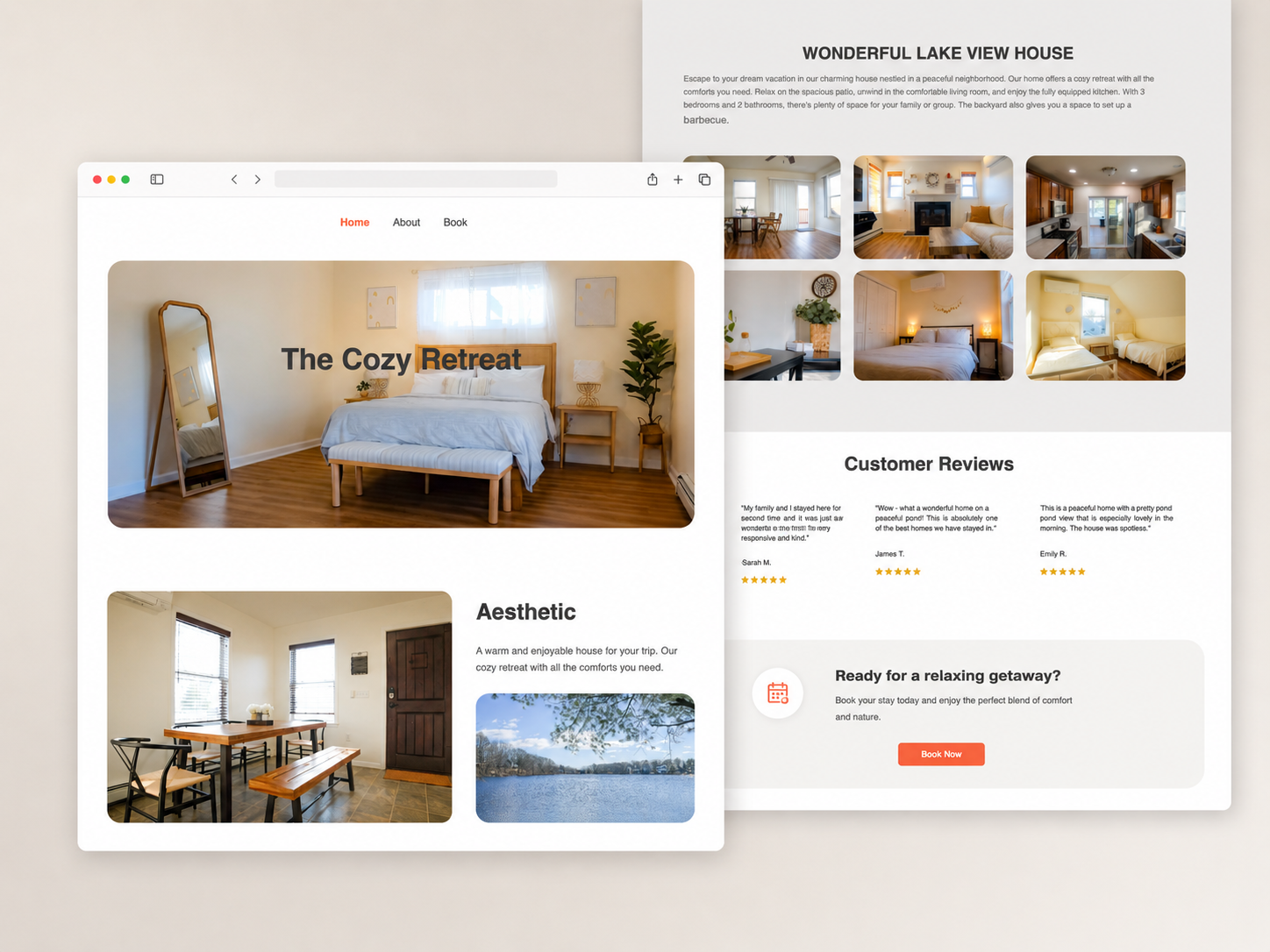
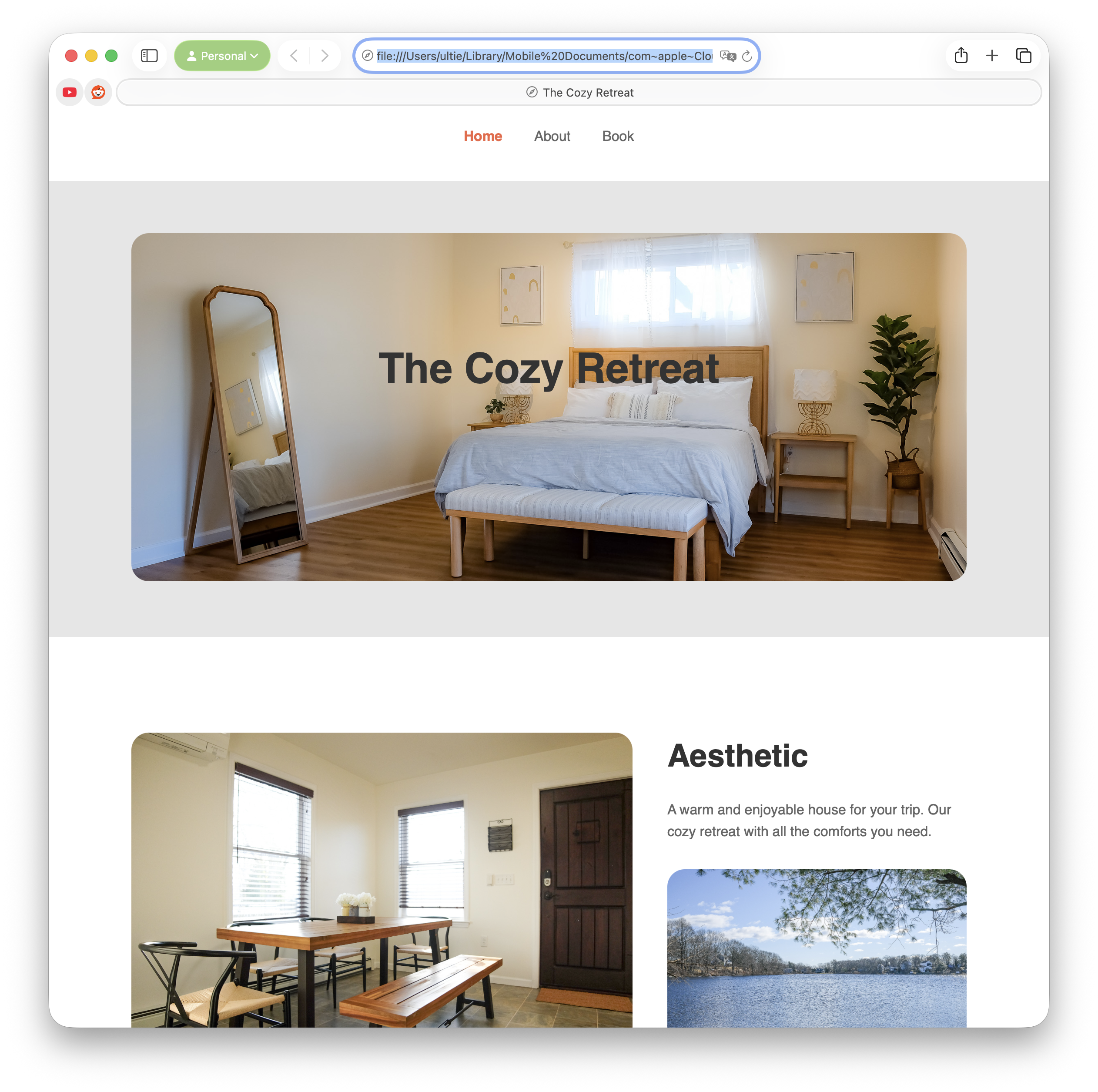
The shipped site
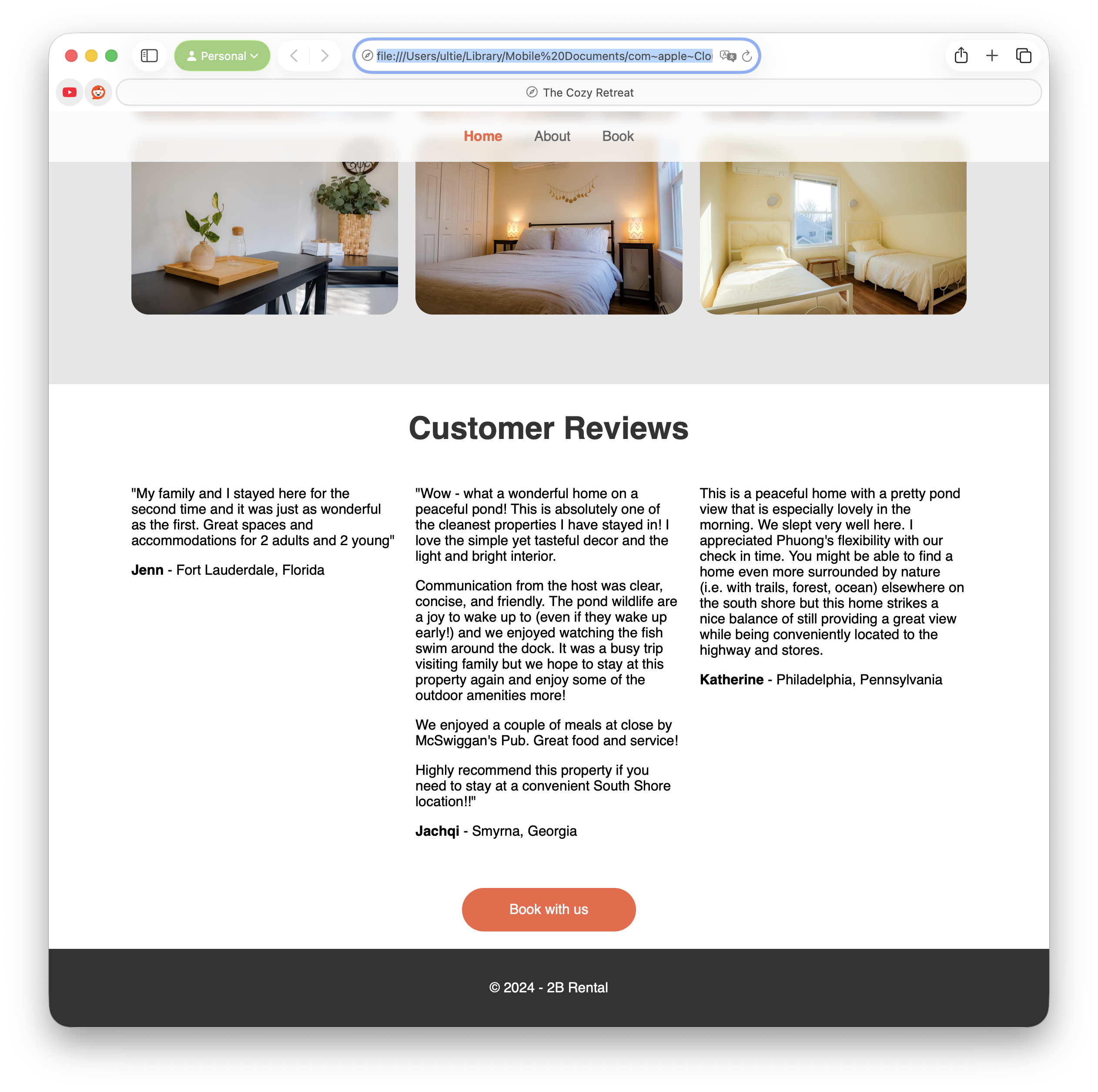
Hand-built in VS Code — no framework, no CMS. Large photography leads, descriptive copy supports, and the gallery stretches across the page so the home stays the hero. Type and spacing were kept calm and consistent to give the imagery room to do the work.
A scroll through the live page — opening on the hero photograph, moving into the gallery and property story, and closing on guest reviews with a single, unmissable booking CTA.
Stack
HTML · CSS · Vanilla JS
Design
Figma
Editor
VS Code
Hosting
GitHub Pagestest only — handed off after launch
Photography
Shot by Phuong Vu
reflection
Key takeaways
01
Designing around the actual photography first made every layout decision easier — the rooms set the palette and rhythm.
02
Owning idea, design, and build end-to-end shortened the feedback loop. Decisions I made in Figma got tested in code the same week.
03
Six months of evenings taught me to ship in slices. The home page came first, earned its keep, then everything else grew around it.