design sprint — UX research & UI
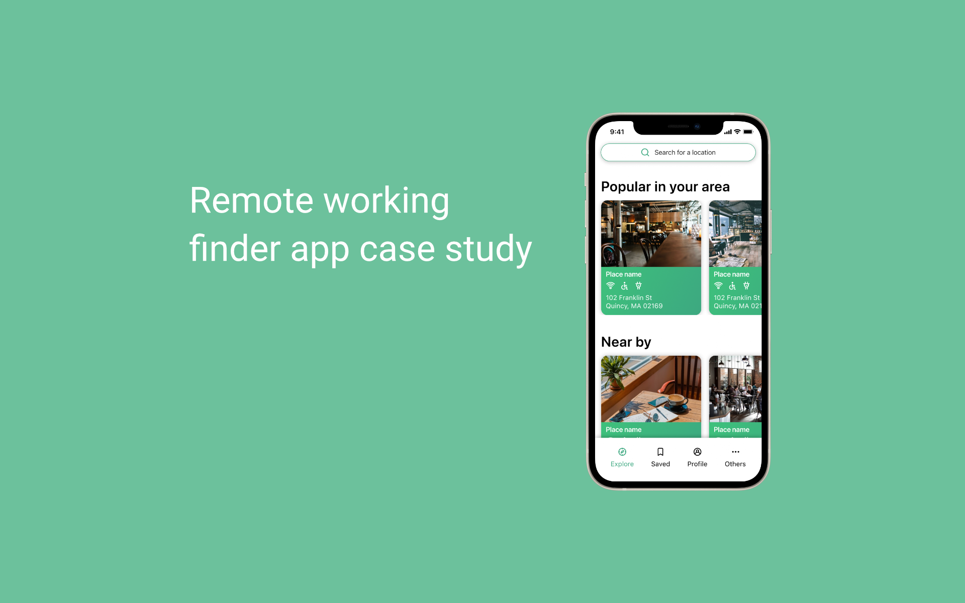
PostUp remote workplace finder
A one-week design sprint to help remote workers quickly find reliable places to work, with the amenities that matter.
the challenge
- Hard to find places with Wi-Fi, outlets, quiet space
- Existing apps lack up-to-date remote-work details
- Users waste time hopping between generic map results
goals
- Quickly surface suitable remote-work spots
- Show amenities clearly (Wi-Fi, power, noise, photos)
- Reduce decision time with trustworthy info
my focus
- Design sprint facilitation
- User flows & prototypes
- Usability testing and iteration
discovery
Research insights
what I learned
- 1Remote workers prioritize Wi-Fi, power, quiet, bathrooms, and photos
- 2General map apps don't surface remote-work-friendly details
- 3People need confidence before committing to a location
design principles
- 1Show the essentials up front — no digging required
- 2Keep filters simple and relevant to the task
- 3Use visuals (photos, tags) to build trust fast
approach
Solution highlights
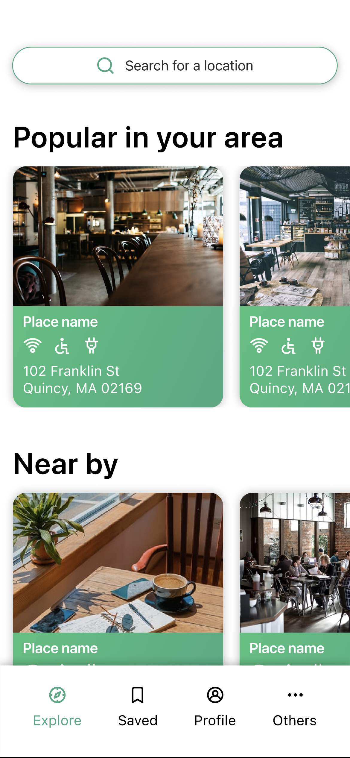
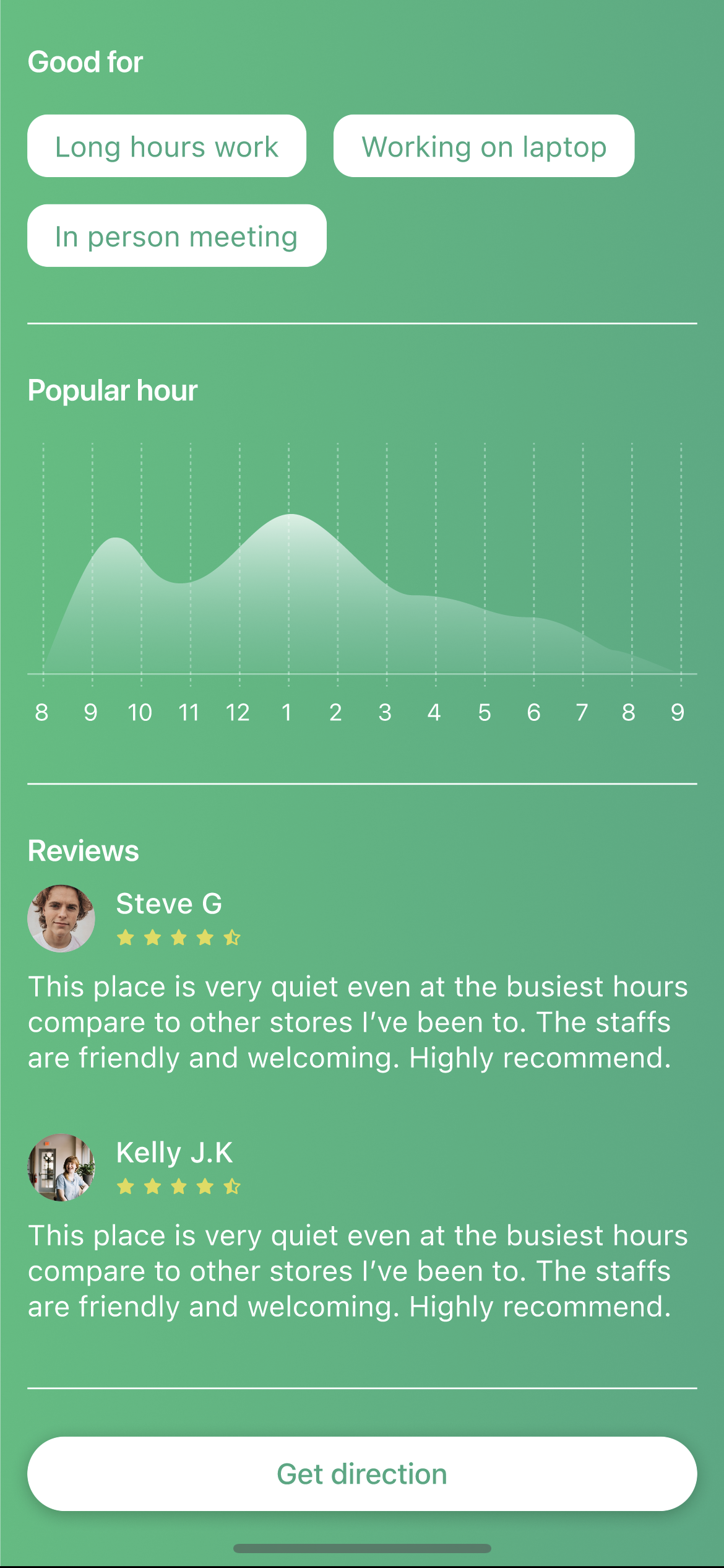
Amenity-first cards
Locations show Wi-Fi, power, noise, and bathrooms at a glance — no digging needed.
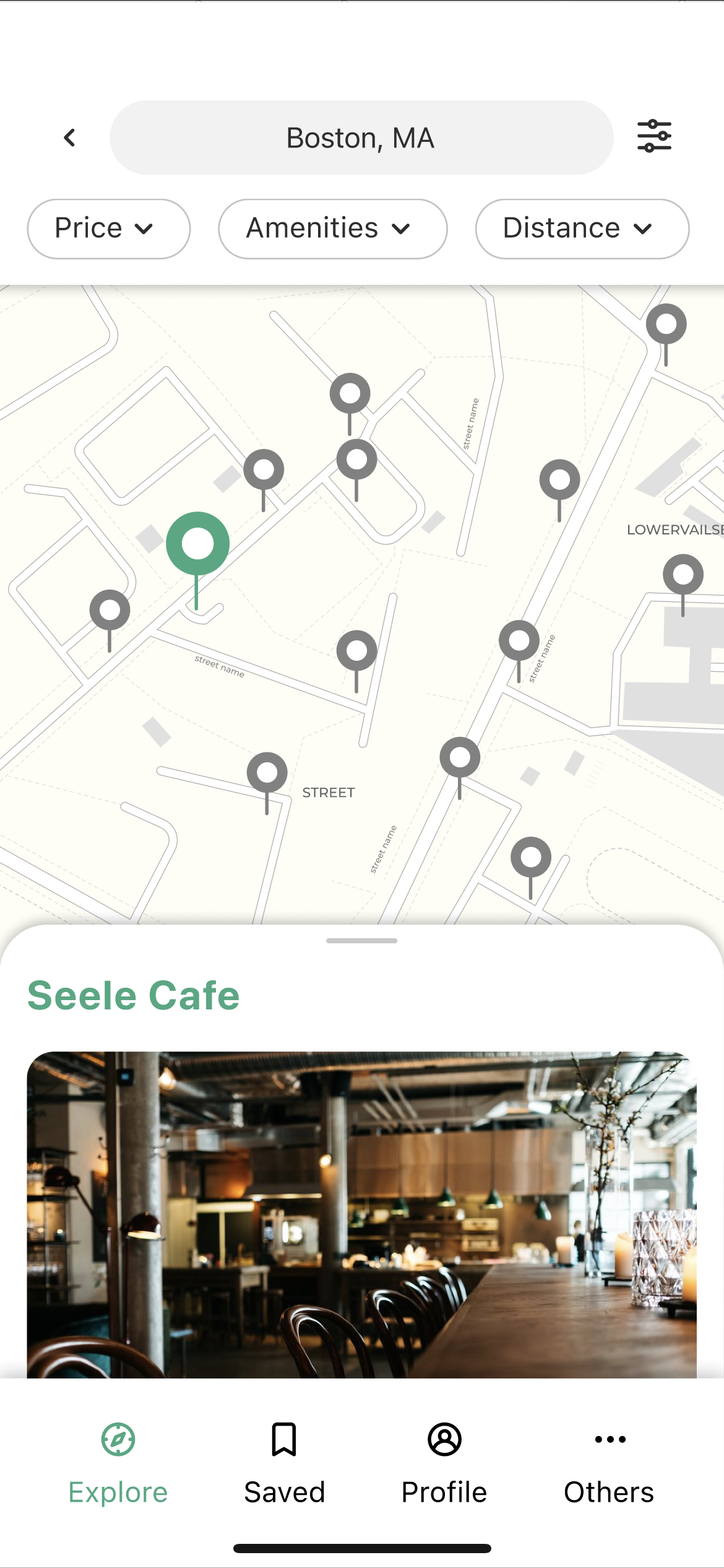
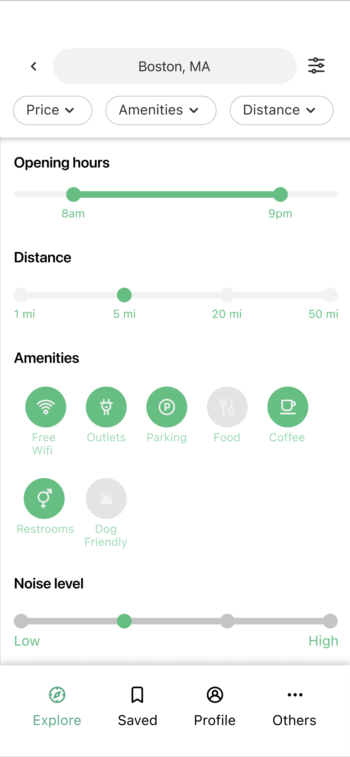
Quick filters
Distance and amenity filters reduce scrolling and decision time dramatically.
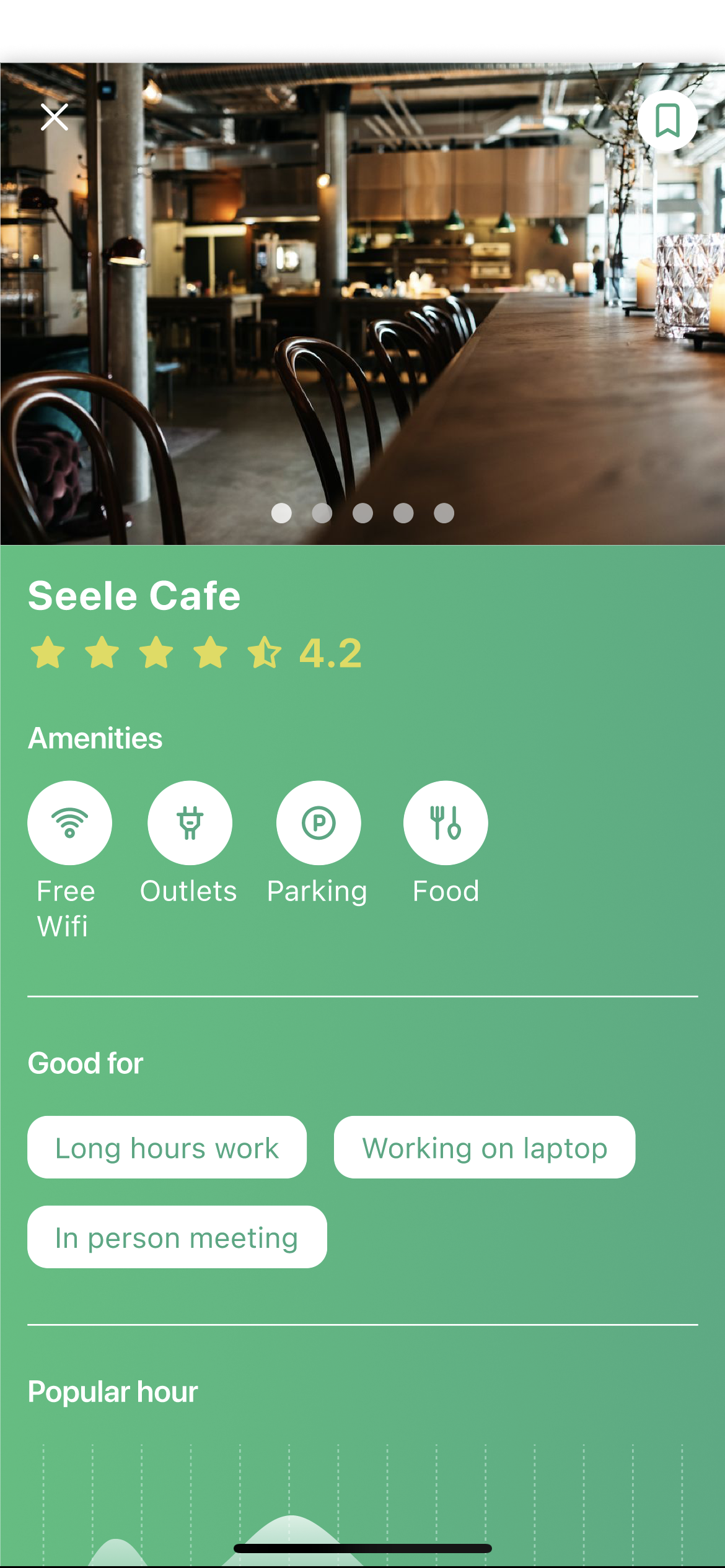
Trust through visuals
Photos and ratings give confidence before visiting a new location.
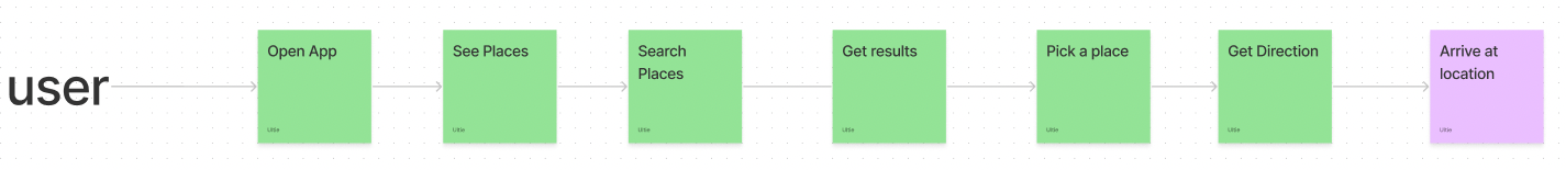
understanding users
User map
sprint method
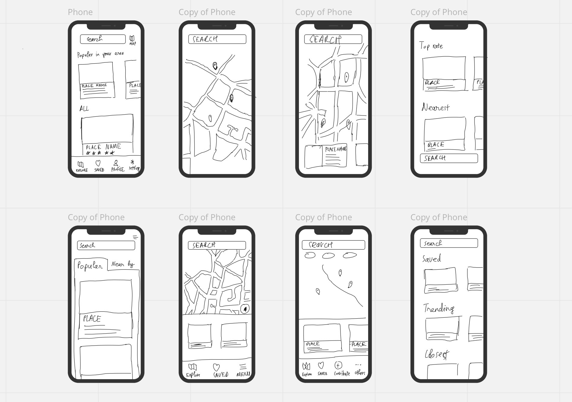
Lightning demo & crazy 8s
Reviewed nearby solutions; sketched eight variations of the search screen to emphasize amenity clarity.
design
Prototype screens
Flow from entry to choosing a location, highlighting trustworthy info and clear filters.
validation
Testing & validation
- Five participants completed the core flow without assistance
- Feedback: add richer list details and flexible distance filters
- Visual amenity tags improved confidence in picking a spot
5/5
Participants completed the
core flow without assistance
interactive
Prototype
reflection
Key takeaways
01
Design sprints are powerful for clarifying MVP essentials fast — constraint breeds focus.
02
Amenity clarity is the critical differentiator for remote workers' confidence in choosing a spot.
03
User feedback quickly and concretely shaped both filter design and list detail density.